Vacuum Widgets
PCDSWidgets comes with a set of symbol widgets each of them composed by an icon and also a control panel.
Before diving into details for each of the symbol widgets available, it is important to highlight what they all have in common.
All widgets share the same base set of properties.
Common Properties
Property |
Type |
Description |
|---|---|---|
channelsPrefix |
str |
The prefix to be used when assembling the channels. E.g. ca://VALVE1 |
showIcon |
bool |
Whether or not to show the widget icon. |
showStatusTooltip |
bool |
Whether or not to show a tooltip with information about interlock, state and error of the widget. |
iconSize |
int |
The icon size. If the value is greater than 0 it the widget will use this value as fixed size otherwise it will expand to fill the area available. |
controlsLocation |
Enum |
Controls where the controls frame will be rendered. Available options are: Top, Bottom, Left, Right and Hidden. |
Controls Location
Here is an example of how the widget looks like with each of the controlsLocation possible values.
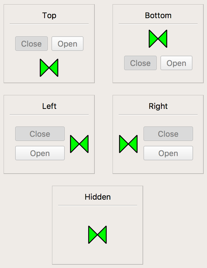
A screenshot of the Pneumatic Valve widget with each of the possible locations for controls.